7 Basic Tools That Can Improve Quality
Hitoshi Kume, a recipient of the 1989 Deming Prize for use of quality principles, defines problems as “undesirable results of a job.” Quality improvement efforts work best when problems are addressed systematically using a consistent and analytic approach; the methodology shouldn’t change just because the problem changes. Keeping the steps to problem-solving simple allows workers to learn the process and how to use the tools effectively.
Easy to implement and follow up, the most commonly used and well-known quality process is the plan/do/check/act (PDCA) cycle (Figure 1). Other processes are a takeoff of this method, much in the way that computers today are takeoffs of the original IBM system. The PDCA cycle promotes continuous improvement and should thus be visualized as a spiral instead of a closed circle.
Another popular quality improvement process is the six-step PROFIT model in which the acronym stands for:
P = Problem definition.
R = Root cause identification and analysis.
O = Optimal solution based on root cause(s).
F = Finalize how the corrective action will be implemented.
I = Implement the plan.
T = Track the effectiveness of the implementation and verify that the desired results are met.
If the desired results are not met, the cycle is repeated. Both the PDCA and the PROFIT models can be used for problem solving as well as for continuous quality improvement. In companies that follow total quality principles, whichever model is chosen should be used consistently in every department or function in which quality improvement teams are working.
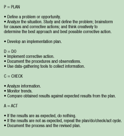
Figure 1. The most common process for quality improvement is the plan/do/check/act cycle outlined above. The cycle promotes continuous improvement and should be thought of as a spiral, not a circle.
7 Basic Quality Improvement Tools
Once the basic problem-solving or quality improvement process is understood, the addition of quality tools can make the process proceed more quickly and systematically. Seven simple tools can be used by any professional to ease the quality improvement process: flowcharts, check sheets, Pareto diagrams, cause and effect diagrams, histograms, scatter diagrams, and control charts. (Some books describe a graph instead of a flowchart as one of the seven tools.)
The concept behind the seven basic tools came from Kaoru Ishikawa, a renowned quality expert from Japan. According to Ishikawa, 95% of quality-related problems can be resolved with these basic tools. The key to successful problem resolution is the ability to identify the problem, use the appropriate tools based on the nature of the problem, and communicate the solution quickly to others. Inexperienced personnel might do best by starting with the Pareto chart and the cause and effect diagram before tackling the use of the other tools. Those two tools are used most widely by quality improvement teams.
Flowcharts
Flowcharts describe a process in as much detail as possible by graphically displaying the steps in proper sequence. A good flowchart should show all process steps under analysis by the quality improvement team, identify critical process points for control, suggest areas for further improvement, and help explain and solve a problem.
The flowchart in Figure 2 illustrates a simple production process in which parts are received, inspected, and sent to subassembly operations and painting. After completing this loop, the parts can be shipped as subassemblies after passing a final test or they can complete a second cycle consisting of final assembly, inspection and testing, painting, final testing, and shipping.
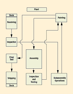
Figure 2. A basic production process flowchart displays several paths a part can travel from the time it hits the receiving dock to final shipping.
Flowcharts can be simple, such as the one featured in Figure 2, or they can be made up of numerous boxes, symbols, and if/then directional steps. In more complex versions, flowcharts indicate the process steps in the appropriate sequence, the conditions in those steps, and the related constraints by using elements such as arrows, yes/no choices, or if/then statements.
Check sheets
Check sheets help organize data by category. They show how many times each particular value occurs, and their information is increasingly helpful as more data are collected. More than 50 observations should be available to be charted for this tool to be really useful. Check sheets minimize clerical work since the operator merely adds a mark to the tally on the prepared sheet rather than writing out a figure (Figure 3). By showing the frequency of a particular defect (e.g., in a molded part) and how often it occurs in a specific location, check sheets help operators spot problems. The check sheet example shows a list of molded part defects on a production line covering a week’s time. One can easily see where to set priorities based on results shown on this check sheet. Assuming the production flow is the same on each day, the part with the largest number of defects carries the highest priority for correction.
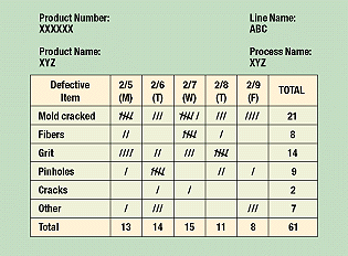
Figure 3. Because it clearly organizes data, a check sheet is the easiest way to track information.
Pareto diagrams
The Pareto diagram is named after Vilfredo Pareto, a 19th-century Italian economist who postulated that a large share of wealth is owned by a small percentage of the population. This basic principle translates well into quality problems—most quality problems result from a small number of causes. Quality experts often refer to the principle as the 80-20 rule; that is, 80% of problems are caused by 20% of the potential sources.
A Pareto diagram puts data in a hierarchical order (Figure 4), which allows the most significant problems to be corrected first. The Pareto analysis technique is used primarily to identify and evaluate nonconformities, although it can summarize all types of data. It is perhaps the diagram most often used in management presentations.
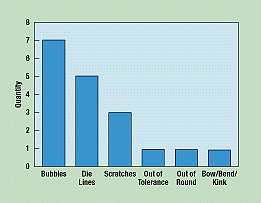
Figure 4. By rearranging random data, a Pareto diagram identifies and ranks nonconformities in the quality process in descending order.
To create a Pareto diagram, the operator collects random data, regroups the categories in order of frequency, and creates a bar graph based on the results.
Cause and effect diagrams
The cause and effect diagram is sometimes called an Ishikawa diagram after its inventor. It is also known as a fish bone diagram because of its shape. A cause and effect diagram describes a relationship between variables. The undesirable outcome is shown as effect, and related causes are shown as leading to, or potentially leading to, the said effect. This popular tool has one severe limitation, however, in that users can overlook important, complex interactions between causes. Thus, if a problem is caused by a combination of factors, it is difficult to use this tool to depict and solve it.
A fish bone diagram displays all contributing factors and their relationships to the outcome to identify areas where data should be collected and analyzed. The major areas of potential causes are shown as the main bones, e.g., materials, methods, people, measurement, machines, and design (Figure 5). Later, the subareas are depicted. Thorough analysis of each cause can eliminate causes one by one, and the most probable root cause can be selected for corrective action. Quantitative information can also be used to prioritize means for improvement, whether it be to machine, design, or operator.
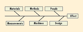
Figure 5. Fish bone diagrams display the various possible causes of the final effect. Further analysis can prioritize them.
Histograms
The histogram plots data in a frequency distribution table. What distinguishes the histogram from a check sheet is that its data are grouped into rows so that the identity of individual values is lost. Commonly used to present quality improvement data, histograms work best with small amounts of data that vary considerably. When used in process capability studies, histograms can display specification limits to show what portion of the data does not meet the specifications.
After the raw data are collected, they are grouped in value and frequency and plotted in a graphical form (Figure 6). A histogram’s shape shows the nature of the distribution of the data, as well as central tendency (average) and variability. Specification limits can be used to display the capability of the process.
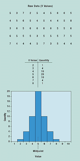
Figure 6. A histogram is an easy way to see the distribution of the data, its average, and variability.
Scatter diagrams
A scatter diagram shows how two variables are related and is thus used to test for cause and effect relationships. It cannot prove that one variable causes the change in the other, only that a relationship exists and how strong it is. In a scatter diagram, the horizontal (x) axis represents the measurement values of one variable, and the vertical (y) axis represents the measurements of the second variable. Figure 7 shows part clearance values on the x-axis and the corresponding quantitative measurement values on the y-axis.
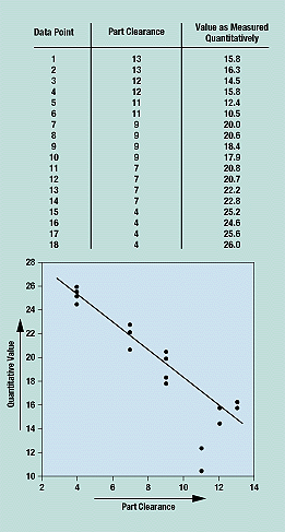
Figure 7. The plotted data points in a scatter diagram show the relationship between two variables.
Control charts
A control chart displays statistically determined upper and lower limits drawn on either side of a process average. This chart shows if the collected data are within upper and lower limits previously determined through statistical calculations of raw data from earlier trials.
The construction of a control chart is based on statistical principles and statistical distributions, particularly the normal distribution. When used in conjunction with a manufacturing process, such charts can indicate trends and signal when a process is out of control. The center line of a control chart represents an estimate of the process mean; the upper and lower critical limits are also indicated. The process results are monitored over time and should remain within the control limits; if they do not, an investigation is conducted for the causes and corrective action taken. A control chart helps determine variability so it can be reduced as much as is economically justifiable.
In preparing a control chart, the mean upper control limit (UCL) and lower control limit (LCL) of an approved process and its data are calculated. A blank control chart with mean UCL and LCL with no data points is created; data points are added as they are statistically calculated from the raw data.
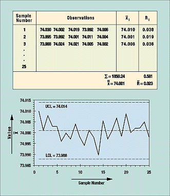
Figure 8. Data points that fall outside the upper and lower control limits lead to investigation and correction of the process.
Figure 8 is based on 25 samples or subgroups. For each sample, which in this case consisted of five rods, measurements are taken of a quality characteristic (in this example, length). These data are then grouped in table form (as shown in the figure) and the average and range from each subgroup are calculated, as are the grand average and average of all ranges. These figures are used to calculate UCL and LCL. For the control chart in the example, the formula is ± A2R, where A2 is a constant determined by the table of constants for variable control charts. The constant is based on the subgroup sample size, which is five in this example.
Conclusion
Many people in the medical device manufacturing industry are undoubtedly familiar with many of these tools and know their application, advantages, and limitations. However, manufacturers must ensure that these tools are in place and being used to their full advantage as part of their quality system procedures. Flowcharts and check sheets are most valuable in identifying problems, whereas cause and effect diagrams, histograms, scatter diagrams, and control charts are used for problem analysis. Pareto diagrams are effective for both areas. By properly using these tools, the problem-solving process can be more efficient and more effective.
Those manufacturers who have mastered the seven basic tools described here may wish to further refine their quality improvement processes. A future article will discuss seven new tools: relations diagrams, affinity diagrams (K-J method), systematic diagrams, matrix diagrams, matrix data diagrams, process decision programs, and arrow diagrams. These seven tools are used less frequently and are more complicated.
Ashweni Sahni is director of quality and regulatory affairs at Minnetronix, Inc. (St. Paul, MN), and a member of MD&DI’s editorial advisory board.
Article source: Qmed and MD+DI


